Fintech · 2022–2023
Aequify
Fintech platform for expats and immigrants managing accounts across multiple countries, transforming scattered, complex financial data into one clear, trustworthy view.
Year
2022–2023
Role
Founding Designer
Scope
0→1 product design · Fintech · Dashboard design
Overview
Managing finances across borders is overwhelming. Users juggle multiple accounts, currencies, and unfamiliar tax requirements like FBAR, often with little clarity on where they stand. Existing solutions were fragmented or too complex, leaving expats stressed rather than informed.
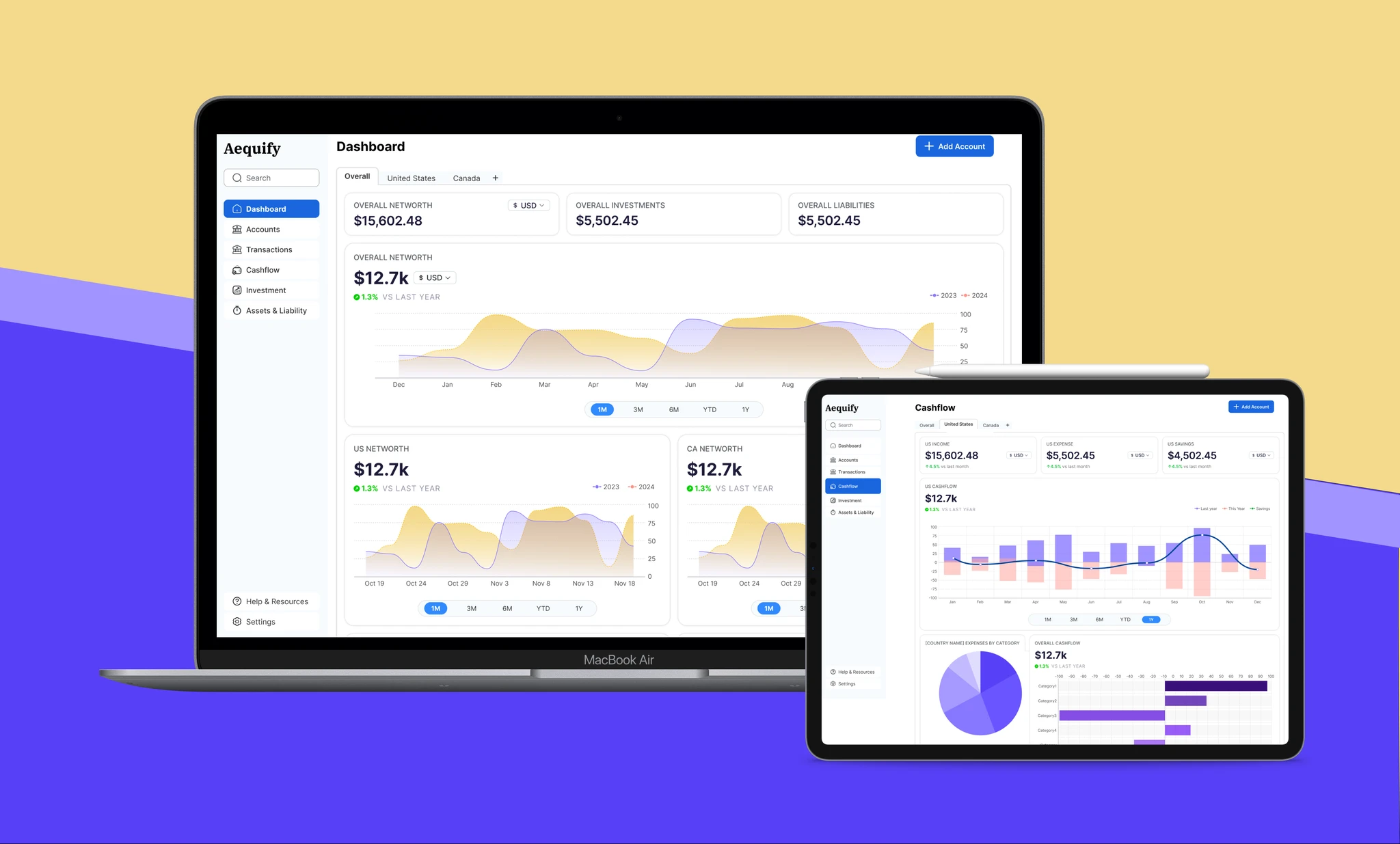
Aequify set out to fix this. As founding designer, I led the product from concept through launch, designing a dashboard that consolidates accounts across multiple countries into one clear, trustworthy view. The goal wasn't just to show the data. It was to reduce the anxiety that comes with not knowing where you stand financially when your money lives in three countries.
Three principles shaped every design decision: clarity of information, trustworthiness, and efficiency. Not features, but principles. They acted as filters on every tradeoff.
Tags
Process
- User research with expats and immigrants
- Desktop-first design approach
- Multi-currency data visualisation
- FBAR tax compliance UX
- Trust-centred design language
Design Question
How might we allow expats to instantly understand their cross-border finances, feel secure sharing sensitive data, and reduce the stress of complex tax obligations?
Key Decisions
Desktop-first, deliberately
Early research showed that most users managed financial planning and tax tasks in a work or home office setting, where larger screens made analysis easier. Desktop-first also allowed for richer data visualizations and more flexible layouts to handle multiple accounts, currencies, and charts at once.
Clarity over completeness
The temptation with multi-account dashboards is to show everything. We made hard editorial choices: which numbers matter most at a glance, which details belong one level deeper, and which data should only appear on demand. Consolidating dozens of accounts and currencies without overwhelming users required constant ruthlessness about what to surface.
Trust as a visual system
Users are sharing access to their actual bank accounts. Every interaction and visual element needed to reinforce security and transparency, from the colour palette to the microcopy to how errors were communicated. Trust isn't a feature; it's the condition under which all other features work.
Quick answers, not deep drill-downs
Financial dashboards often bury the insight. We designed around the most important questions users had when they opened the app: what's my total balance, am I on track for FBAR filing, did anything unusual happen? The dashboard answered these before users needed to ask. Depth was available, but the surface was efficient.
Information Architecture
Outcome
Hrs → Min
FBAR filing time
Dramatically reduced for users
In control
User sentiment
"First time I feel in control of my finances"
Core
Product role
Became the value proposition centerpiece
0 → 1
Design ownership
Founding designer from day one
Reflection
Designing for financial anxiety is different from designing for financial complexity. Users managing cross-border finances aren’t just confused. They’re stressed. The design challenge wasn’t simplification alone; it was building enough trust that users would connect their actual bank accounts and rely on the dashboard for decisions that actually mattered. Every detail, from microcopy to empty states to error handling, needed to carry that weight.