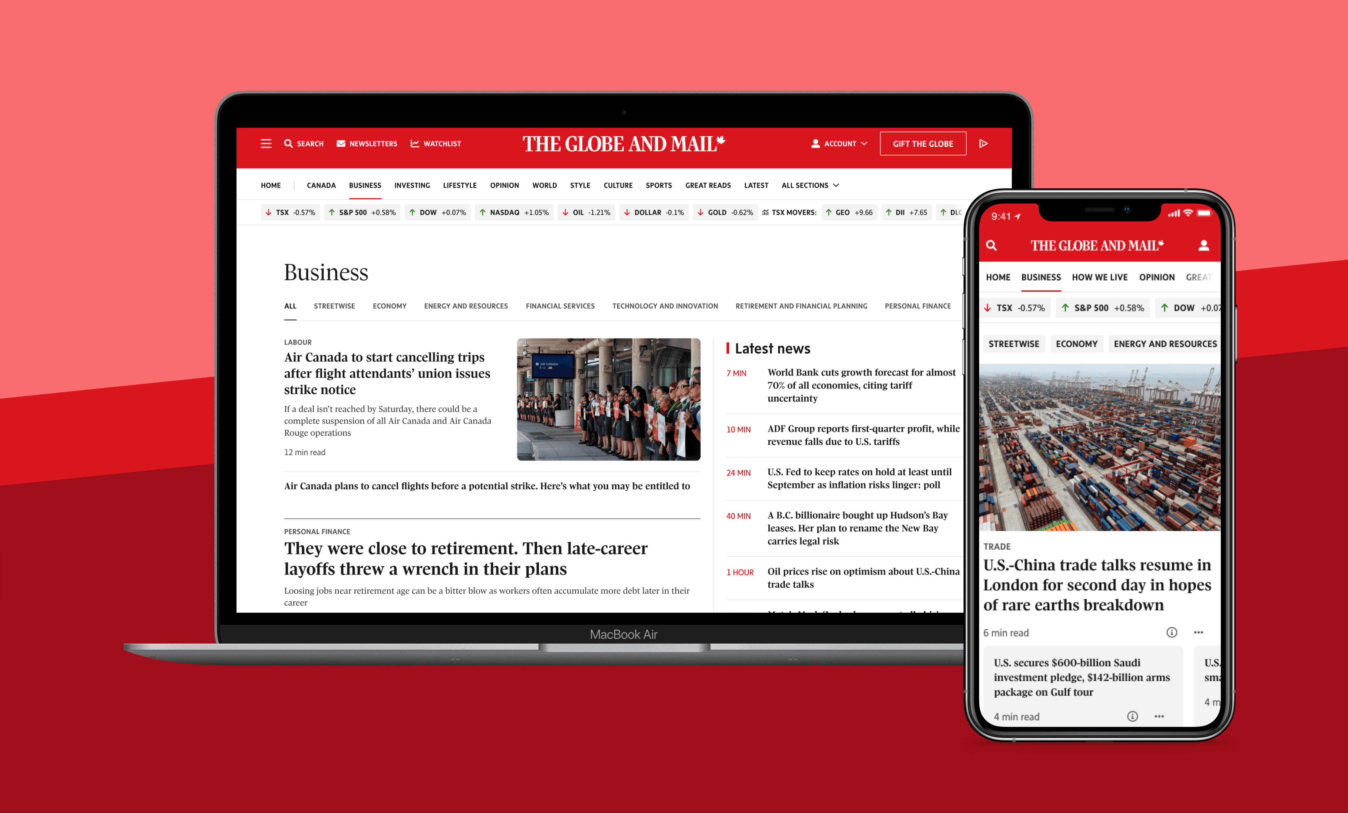
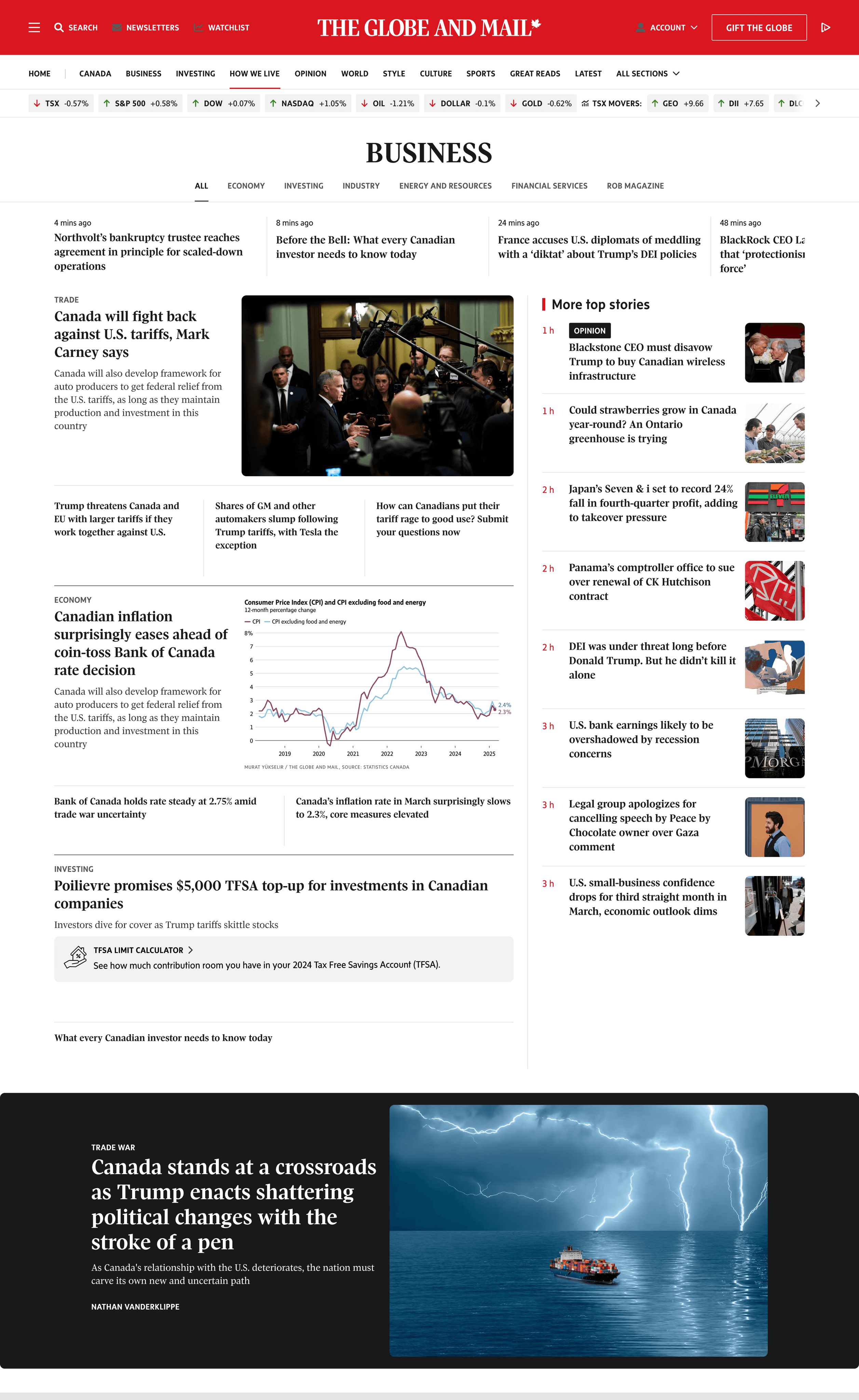
Business Section of The Globe and Mail

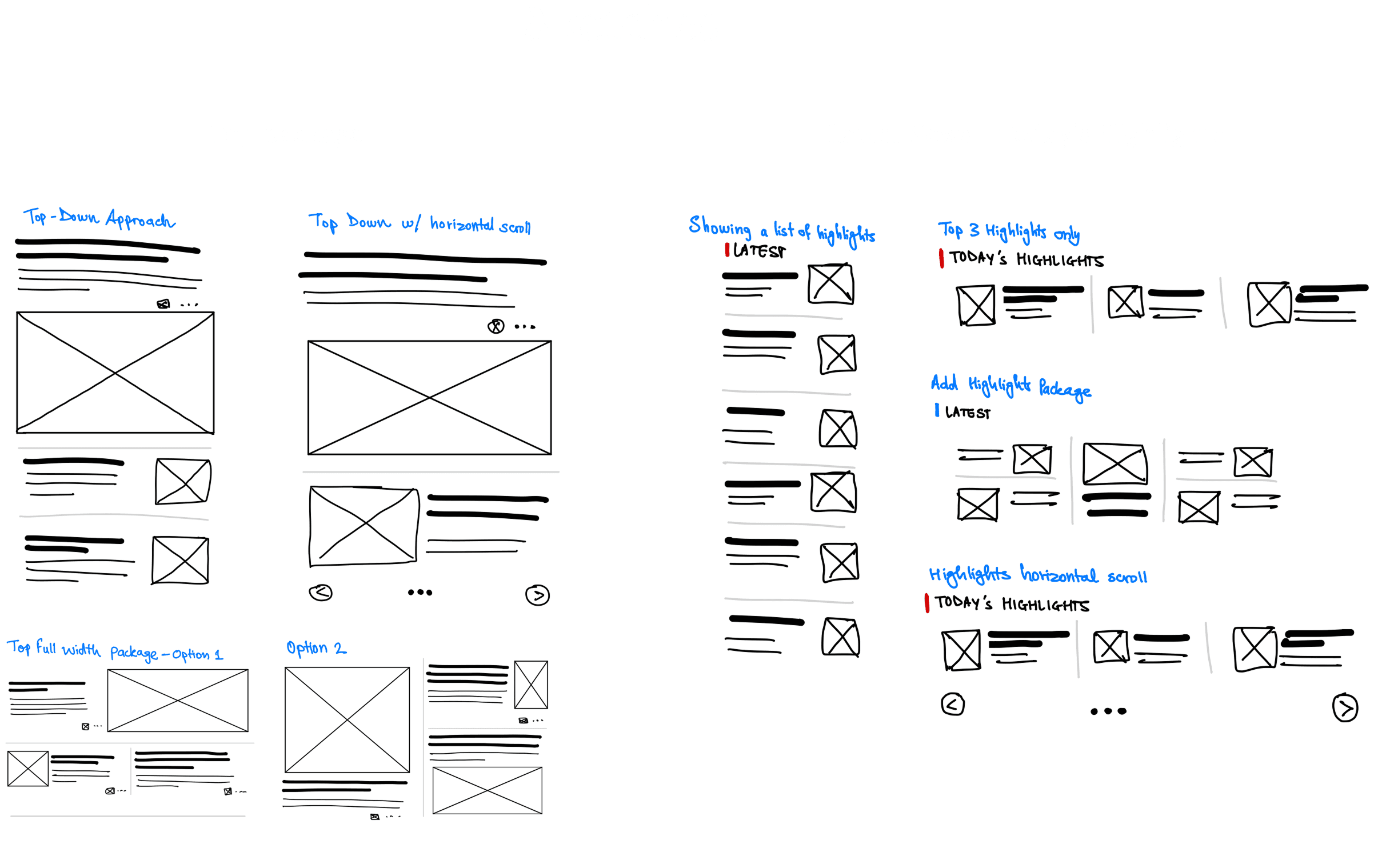
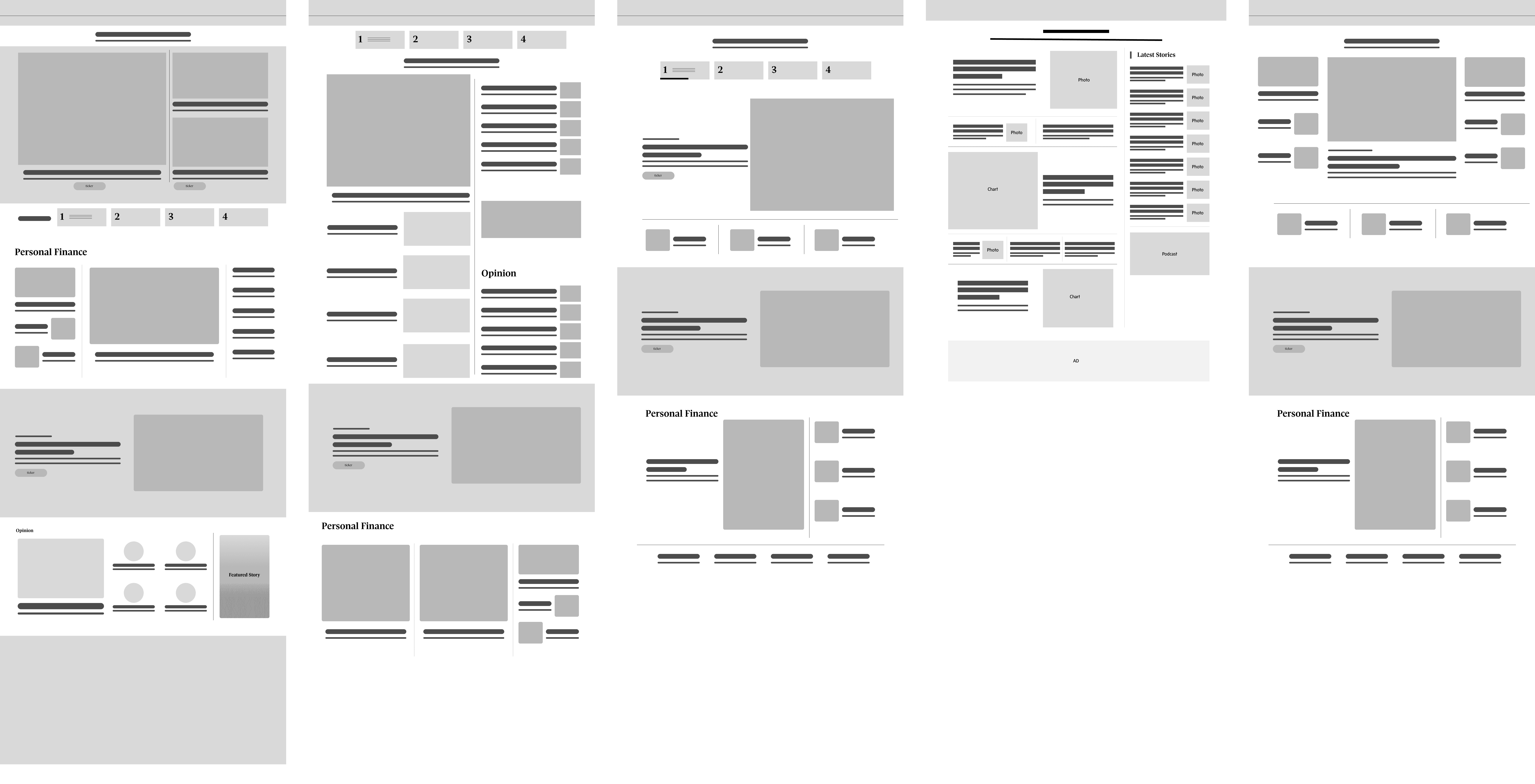
I redesigned The Globe and Mail’s Business section, one of the most visited and revenue driving pages on the site. The project focused on creating a modern, reader friendly experience that helped people find articles quickly, stay current with the latest news, and explore content by category while supporting the company’s goal of growing digital subscriptions.

Challenge

  • Outdated design: The page looked dated and did not reflect the expectations of a modern digital news platform.

  • Lack of timeliness: Readers visit the Business section to stay updated and feel a sense of urgency, but the previous design did not convey freshness or immediacy of news.

  • Cluttered layout: Different content types blended together, creating visual noise and making it difficult to scan or focus on priority stories.

  • No day parting: The experience was the same at all times of day and on weekends, missing opportunities to tailor the layout and content mix to different reader needs.

My Role

I was tasked with leading the redesign of the Business section page. My responsibilities included:

  • Updating the overall design to feel modern and current.

  • Improving how articles were surfaced, so readers could quickly access the latest and most relevant stories

  • Organizing the page into clear content categories, making it easier to scan and explore

  • Ensuring the design reinforced trust and authority, key factors for driving subscription decisions

Outcome

The redesign delivered a cleaner, more structured experience that made the page easier to browse and more aligned with current digital design standards. Articles were surfaced in a way that made readers feel up to date with the latest news, while new content organization helped them dive deeper into areas of interest. The design positioned the Business page to better support The Globe and Mail’s digital subscription goals.

Research

Competitive Review

I conducted a competitive review of leading news and media sites to understand how they present business content, highlight breaking stories, and organize complex information.

Based on the review, I organized the Business section into clear content areas that reflected how readers naturally look for news, such as markets, economy, and opinion.

How might we

redesign the Business section so readers can quickly feel up to date, navigate content with ease, and experience a page that adapts to their needs in a modern and dynamic way?

Initial sketches

I sketched multiple layout ideas to quickly explore different structures and spark brainstorming before moving into detailed designs.

Prototypes

Lo-Fidelity Prototype

I translated the sketches into low-fidelity wireframes to test layout structures, content hierarchy, and overall flow without focusing on visual design details.

Hi-Fidelity Prototype

I created high fidelity designs and shared them with stakeholders including the VP of Design, product managers, and the editorial team. Their feedback helped refine the layout, visual style, and content priorities.

Mobile variations

I created three mobile variations to explore different layouts, test content hierarchy, and ensure the Business section stayed easy to scan and felt timely on smaller screens.

Desktop Variations

I created three high fidelity desktop variations to explore different approaches to hierarchy, layout, and content presentation. Each variation tested how breaking news, in-depth analysis, and feature packages could be surfaced on the page, while balancing clarity and visual impact. These variations gave stakeholders options to compare and provided a strong foundation for feedback and refinement.

Development handoff

Here is an example of the Great Reads package. I documented how it should adapt across desktop, tablet and mobile, with variations for thumbnail, standard, and image background cards. I also outlined layout and interaction details so developers could implement the design as intended.

Key Learnings

What did I learn from this project?

  • Gained experience balancing editorial priorities with user needs

  • Saw how early sketches and variations speed up alignment and make stakeholder feedback more productive

Let's Collaborate

Let's talk about a project,
collaboration or an idea you may have

Promotion Path to Purchase

This case study outlines the enhancement of the promotion experience on the Home Depot App during a contract with Home Depot Canada. The project addressed the challenge of a non-intuitive promotion process during checkout, focusing on streamlining the user journey from the first interaction to the seamless addition of products.

This case study outlines the enhancement of the promotion experience on the Home Depot App during a contract with Home Depot Canada. The project addressed the challenge of a non-intuitive promotion process during checkout, focusing on streamlining the user journey from the first interaction to the seamless addition of products.

Problem

The Home Depot faced several challenges:

The Home Depot faced several challenges:

  1. Lack of Visibility for Promotions: Promotions were not always easily discoverable, users had to navigate through multiple steps to find applicable promotions.

  2. Complex Promotion Rules: Some promotions had complicated terms and conditions, which were not clearly communicated to the users.

  3. Non-Intuitive Promotion Application: Users often found it difficult to apply promotions during checkout, leading to confusion and frustration.

Problem

The Home Depot faced several challenges:

  1. Lack of Visibility for Promotions: Promotions were not always easily discoverable, users had to navigate through multiple steps to find applicable promotions.

  2. Complex Promotion Rules: Some promotions had complicated terms and conditions, which were not clearly communicated to the users.

  3. Non-Intuitive Promotion Application: Users often found it difficult to apply promotions during checkout, leading to confusion and frustration.

What is Promotion Experience?

Customers are presented with enticing promotions: upon meeting specific purchase criteria, they receive additional products at no extra cost. This can manifest as either a set quantity of items purchased resulting in free items, or the option to choose complimentary products from a designated selection. These promotions not only provide tangible value to customers but also serve as potent drivers of sales and brand loyalty, enriching the overall shopping experience with enticing incentives.

Customers are presented with enticing promotions: upon meeting specific purchase criteria, they receive additional products at no extra cost. This can manifest as either a set quantity of items purchased resulting in free items, or the option to choose complimentary products from a designated selection. These promotions not only provide tangible value to customers but also serve as potent drivers of sales and brand loyalty, enriching the overall shopping experience with enticing incentives.

What is Promotion Experience?

Customers are presented with enticing promotions: upon meeting specific purchase criteria, they receive additional products at no extra cost. This can manifest as either a set quantity of items purchased resulting in free items, or the option to choose complimentary products from a designated selection. These promotions not only provide tangible value to customers but also serve as potent drivers of sales and brand loyalty, enriching the overall shopping experience with enticing incentives.

Solution

The solution involved a holistic approach to rebranding and digital transformation:

The solution involved a holistic approach to rebranding and digital transformation:

  1. Enhanced User Interface: The designers improved the user interface to highlight personalized promotions more prominently.

  2. Clear Instructions and Feedback: Provided clear instructions and real-time feedback on what the promotion is and how to qualify for it.

  3. Promotion Callouts: Enhanced visibility by integrating prominent banners or callouts on the product pages.

Solution

The solution involved a holistic approach to rebranding and digital transformation:

  1. Enhanced User Interface: The designers improved the user interface to highlight personalized promotions more prominently.

  2. Clear Instructions and Feedback: Provided clear instructions and real-time feedback on what the promotion is and how to qualify for it.

  3. Promotion Callouts: Enhanced visibility by integrating prominent banners or callouts on the product pages.

Research

Secondary Research

Through secondary research, we discovered that effectively communicating information to customers is vital in mitigating frustration and ensuring a positive experience.

Through secondary research, we discovered that effectively communicating information to customers is vital in mitigating frustration and ensuring a positive experience.

Additionally, our research indicated that displaying reminders about promotions can notably enhance the shopping experience for customers.

To build trust and confidence, avoiding sneaky and aggressive promotion became our priority.

Additionally, our research indicated that displaying reminders about promotions can notably enhance the shopping experience for customers.

To build trust and confidence, avoiding sneaky and aggressive promotion became our priority.

Research

Secondary Research

Through secondary research, we discovered that effectively communicating information to customers is vital in mitigating frustration and ensuring a positive experience.

Additionally, our research indicated that displaying reminders about promotions can notably enhance the shopping experience for customers.

To build trust and confidence, avoiding sneaky and aggressive promotion became our priority.

How might we

create a seamless experience for our customers who want to take advantage of promotions on the app.

How might we

create a seamless experience for our customers who want to take advantage of promotions on the app.

Current State and Competitive Analysis

Through current state analysis, the process and potential pain points of users were identified. It was observed that to access the promotion, customers needed to click on the promotion message, with no reminder provided when they added the first product.

Through current state analysis, the process and potential pain points of users were identified. It was observed that to access the promotion, customers needed to click on the promotion message, with no reminder provided when they added the first product.

Through competitive analysis, the latest trends and user experiences familiar to customers were identified. This highlighted the importance of emphasizing customer reminders and providing confirmation messages.

Through competitive analysis, the latest trends and user experiences familiar to customers were identified. This highlighted the importance of emphasizing customer reminders and providing confirmation messages.

Current State and Competitive Analysis

Through current state analysis, the process and potential pain points of users were identified. It was observed that to access the promotion, customers needed to click on the promotion message, with no reminder provided when they added the first product.

Through competitive analysis, the latest trends and user experiences familiar to customers were identified. This highlighted the importance of emphasizing customer reminders and providing confirmation messages.

Ideate

Crazy 4's Exercise

By participating in Crazy 4's exercise, I could clearly visual the design flow and brainstorm 4 different ideas for the modal.

By participating in Crazy 4's exercise, I could clearly visual the design flow and brainstorm 4 different ideas for the modal.

Additionally, our research indicated that displaying reminders about promotions can notably enhance the shopping experience for customers.

To build trust and confidence, avoiding sneaky and aggressive promotion became our priority.

Additionally, our research indicated that displaying reminders about promotions can notably enhance the shopping experience for customers.

To build trust and confidence, avoiding sneaky and aggressive promotion became our priority.

Ideate

Crazy 4's Exercise

By participating in Crazy 4's exercise, I could clearly visual the design flow and brainstorm 4 different ideas for the modal.

Additionally, our research indicated that displaying reminders about promotions can notably enhance the shopping experience for customers.

To build trust and confidence, avoiding sneaky and aggressive promotion became our priority.

Edge Cases

Multiple Promotions

The scenario where a customer qualifies for or receives more than one promotional offer to choose from.

The scenario where a customer qualifies for or receives more than one promotional offer to choose from.

Edge Cases

Multiple Promotions

The scenario where a customer qualifies for or receives more than one promotional offer to choose from.

Skip Promotions

The scenario where a customer can skip adding the promotion items to their cart.

The scenario where a customer can skip adding the promotion items to their cart.

Skip Promotions

The scenario where a customer can skip adding the promotion items to their cart.

Update Promotions

The scenario where a customer qualifies for or receives more than one promotional offer to choose from.

The scenario where a customer qualifies for or receives more than one promotional offer to choose from.

Update Promotions

The scenario where a customer qualifies for or receives more than one promotional offer to choose from.

Prototype

Hi-Fidelity Prototype

After getting feedback from stakeholders and other team members, we reiterated the designs and created a prototype for Usability Testing

After getting feedback from stakeholders and other team members, we reiterated the designs and created a prototype for Usability Testing

Prototype

Hi-Fidelity Prototype

After getting feedback from stakeholders and other team members, we reiterated the designs and created a prototype for Usability Testing

Test

User Goals

We determined user goals to understand different scenarios that a user might come across while using this experience. Some goals we listed are:

  1. Be able to differentiate between different types of promotions.

  2. Be able to confirm that the promotion has been added to the cart.

We determined user goals to understand different scenarios that a user might come across while using this experience. Some goals we listed are:

  1. Be able to differentiate between different types of promotions.

  2. Be able to confirm that the promotion has been added to the cart.

Test

User Goals

We determined user goals to understand different scenarios that a user might come across while using this experience. Some goals we listed are:

  1. Be able to differentiate between different types of promotions.

  2. Be able to confirm that the promotion has been added to the cart.

Affinity Mapping

Organized notes from unmoderated user tests by grouping them into different themes. This helped us identify the intuitive experience and some possible issues:

  1. Some users closed the promotion modal to add product X before adding product Y.

  2. Some users wanted to learn more about product X on the promotion modal.

Affinity Mapping

Organized notes from unmoderated user tests by grouping them into different themes. This helped us identify the intuitive experience and some possible issues:

  1. Some users closed the promotion modal to add product X before adding product Y.

  2. Some users wanted to learn more about product X on the promotion modal.

Reiterate

Final Mocks

Based on the insights gathered from the usability test, I designed these final mocks.

Based on the insights gathered from the usability test, I designed these final mocks.

Primary changes made in these designs:

  1. The experience of selecting another item was improved.

  2. A clear call out for confirmation of adding promotion to the cart.

Primary changes made in these designs:

  1. The experience of selecting another item was improved.

  2. A clear call out for confirmation of adding promotion to the cart.

Reiterate

Final Mocks

Based on the insights gathered from the usability test, I designed these final mocks.

Primary changes made in these designs:

  1. The experience of selecting another item was improved.

  2. A clear call out for confirmation of adding promotion to the cart.

Key Learnings

What did I learn from this project?

  • Reflecting on this project, I've gained valuable insights into the importance of maintaining consistency across platforms.

  • Collaborating within a cross-functional team highlighted the significance of effective communication and alignment to achieve our goals efficiently.

  • Stepping into the user's shoes emphasized the necessity of considering edge cases to ensure a seamless and user-friendly experience

Key Learnings

What did I learn from this project?

  • Reflecting on this project, I've gained valuable insights into the importance of maintaining consistency across platforms.

  • Collaborating within a cross-functional team highlighted the significance of effective communication and alignment to achieve our goals efficiently.

  • Stepping into the user's shoes emphasized the necessity of considering edge cases to ensure a seamless and user-friendly experience

Let's Collaborate

Let's talk about a project,
collaboration or an idea you may have

Let's Collaborate

Let's talk about a project,
collaboration or an idea you may have