SRMD - A Spiritual Organization
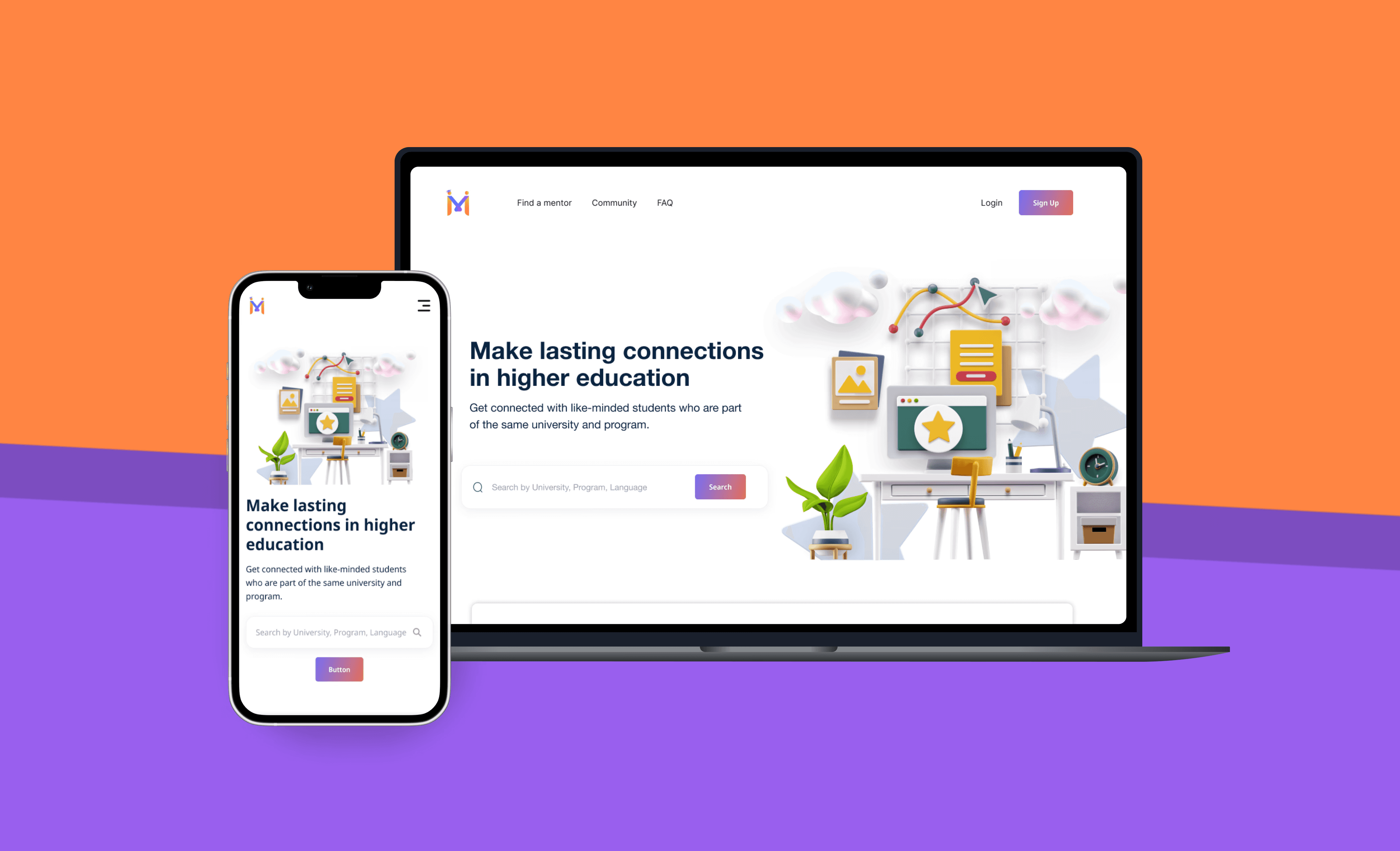
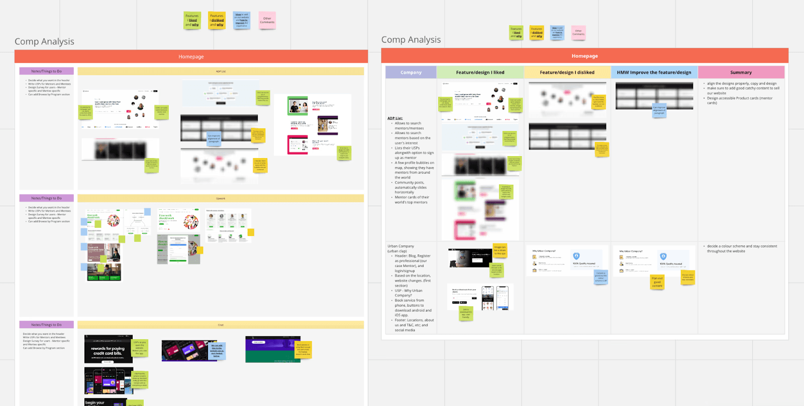
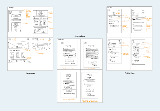
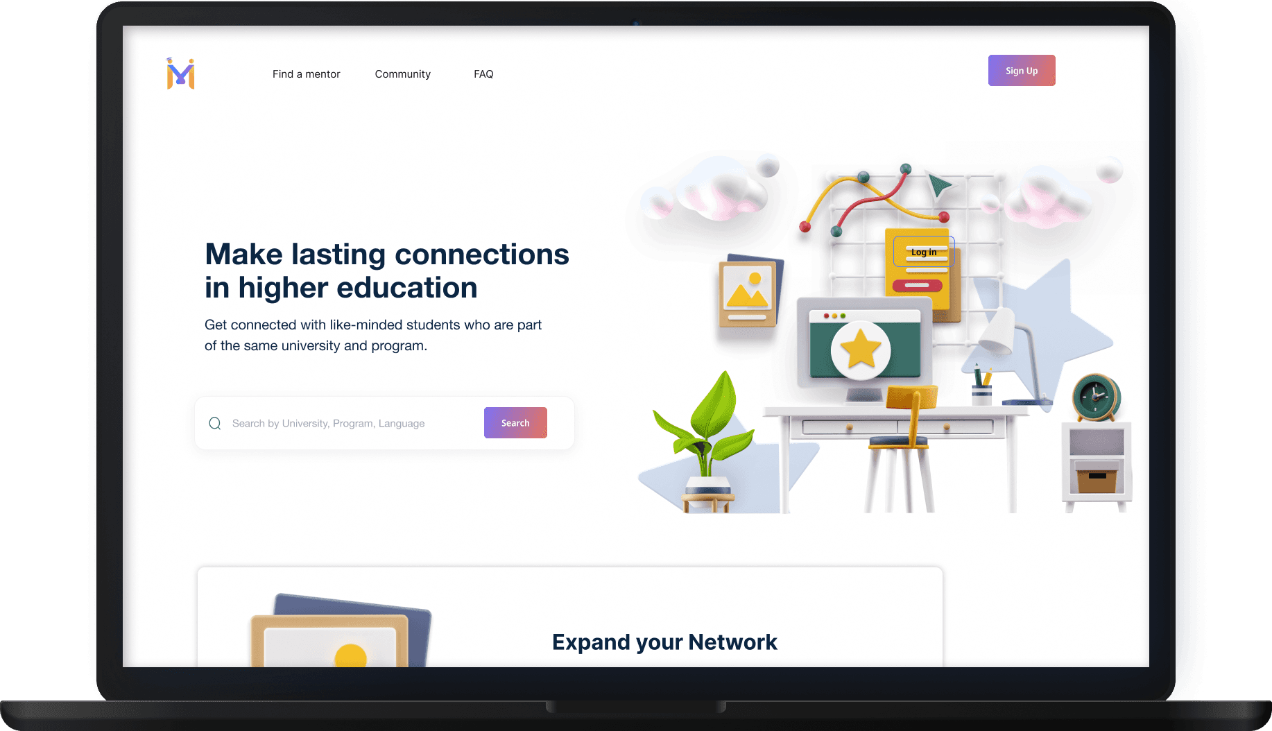
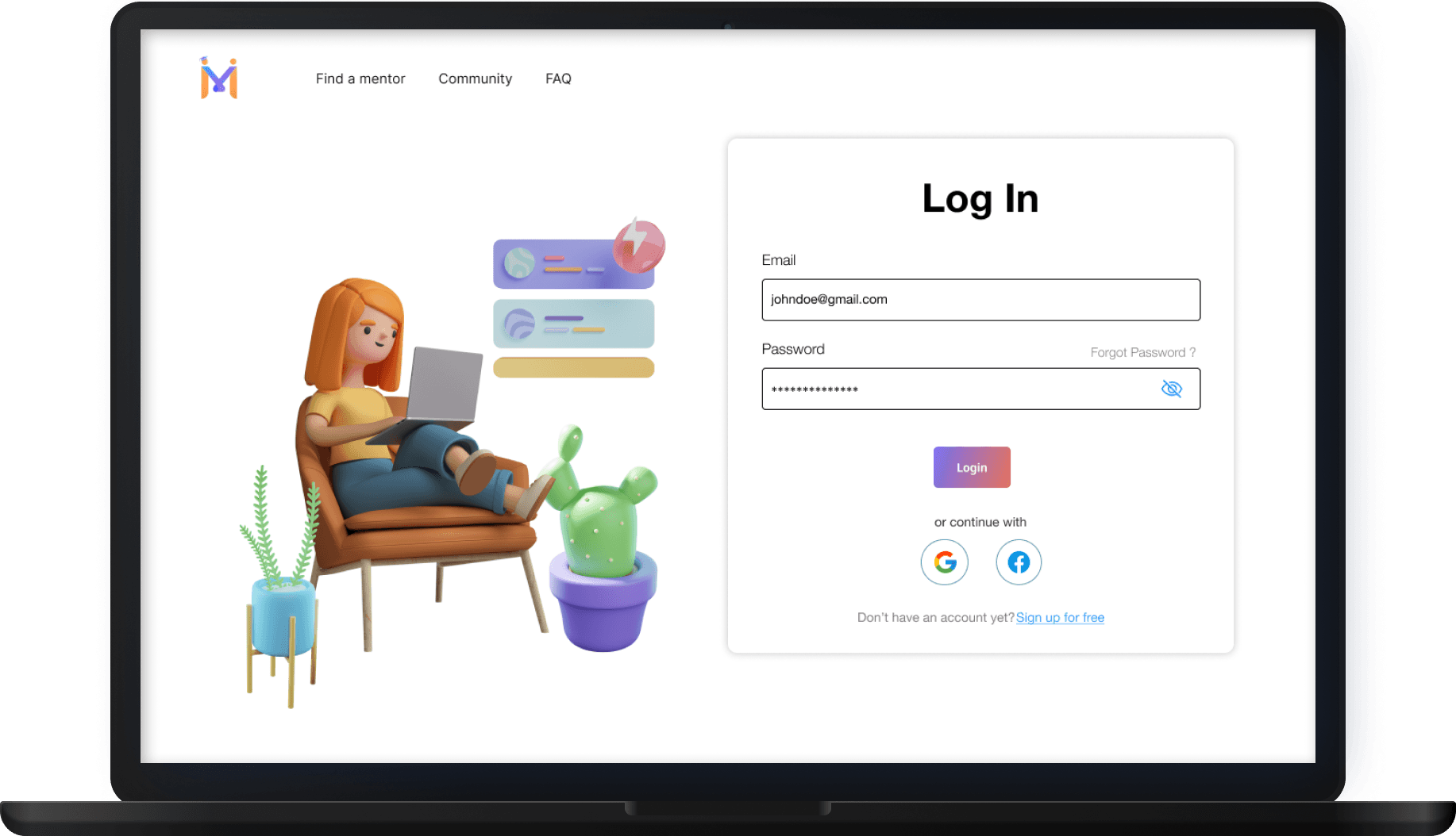
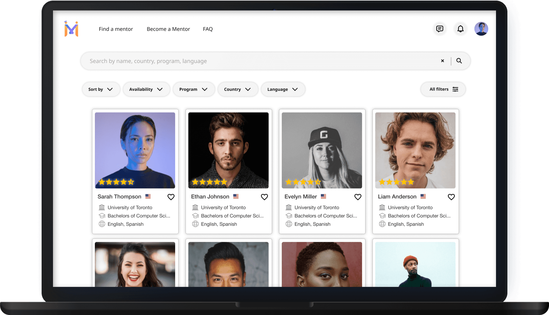
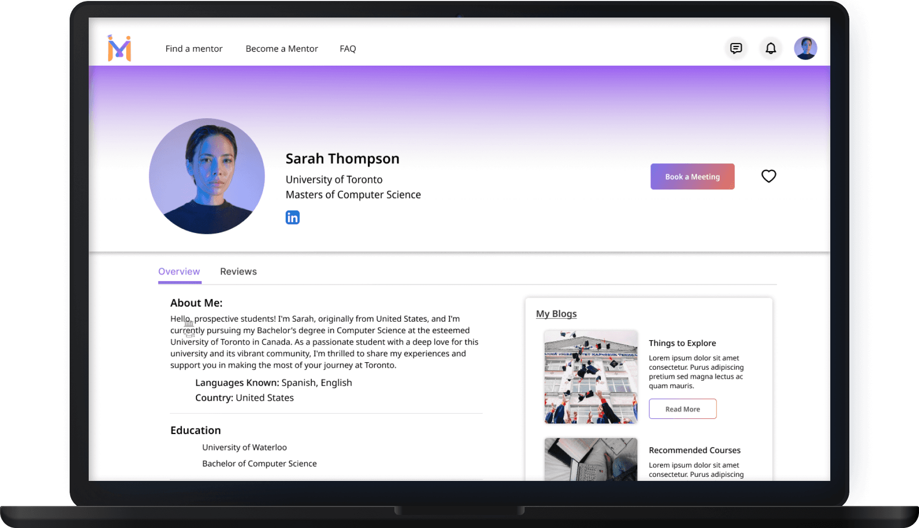
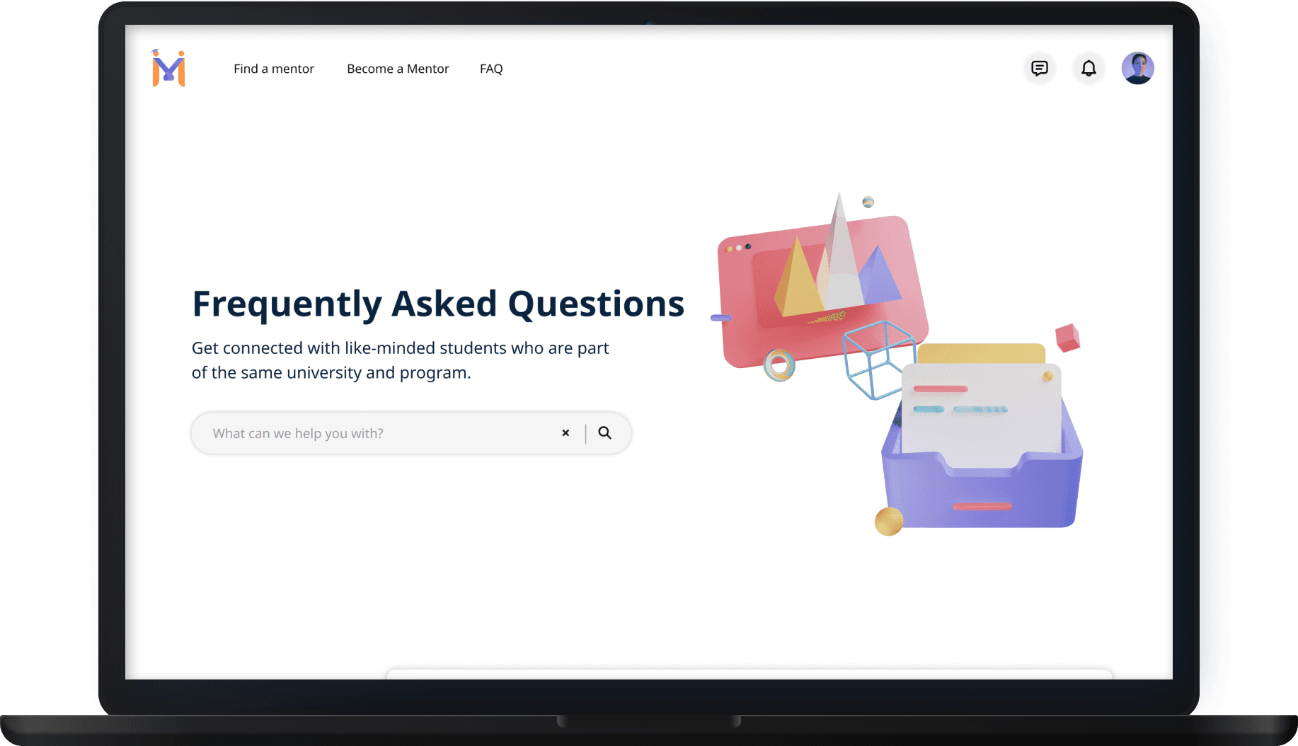
I had the exciting opportunity to work on a startup project that aimed to connect prospective international students with current/alumni students from their prospective universities. The goal was to provide valuable insights, guidance, and support to students during their university selection process.
I had the exciting opportunity to work on a startup project that aimed to connect prospective international students with current/alumni students from their prospective universities. The goal was to provide valuable insights, guidance, and support to students during their university selection process.