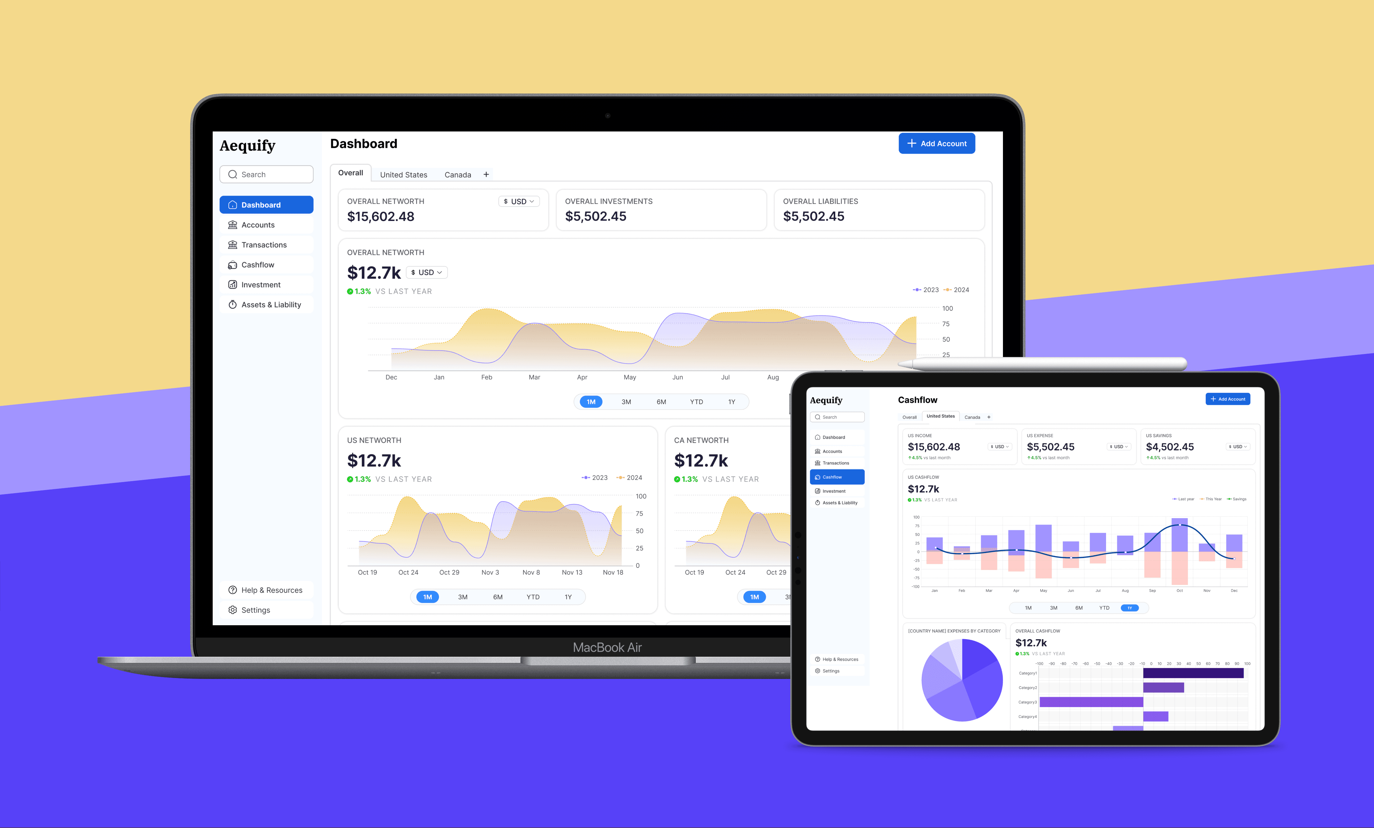
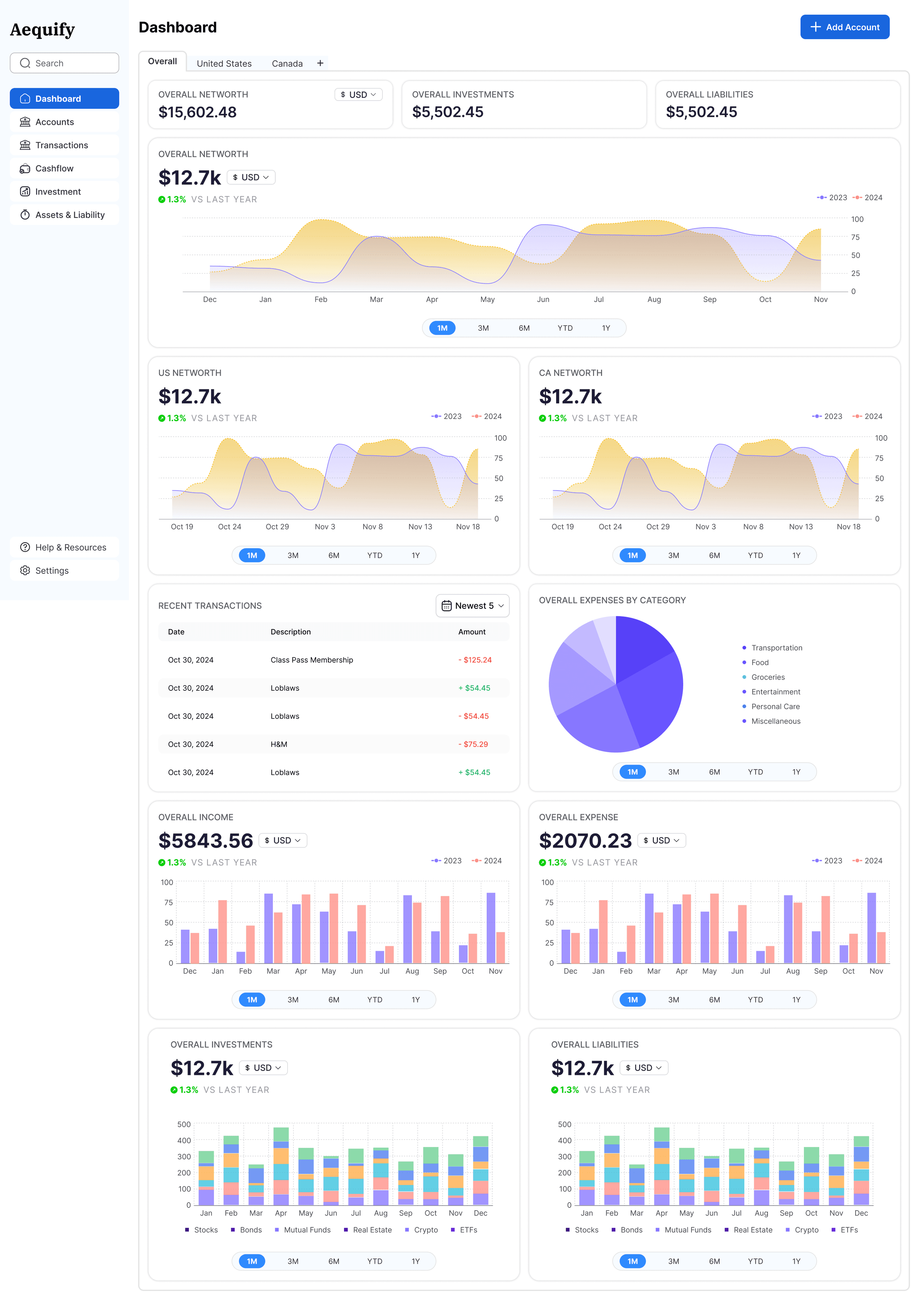
Aequify

Aequify is a fintech platform for expats and immigrants managing accounts across multiple countries. The goal was to design a dashboard that transforms scattered, complex financial data into one clear, trustworthy view, reducing stress around money management and tax obligations.

The Challenge

Managing finances across borders is overwhelming. Users often juggle multiple accounts, currencies, and unfamiliar tax requirements such as FBAR. Existing solutions were fragmented or too complex, leaving users with little clarity or confidence.

As a founding designer, my challenge was to create a dashboard that simplifies complexity, communicates trust, and delivers insights quickly.

Approach

Three principles guided the work:

  1. Clarity of information: Consolidate dozens of accounts and currencies without overwhelming the user.

  2. Trustworthiness: Every interaction and visual element needed to reinforce security and transparency.

  3. Efficiency: Provide quick answers, not layers of unnecessary charts.

Impact

Three principles guided the work:

  • Users described the dashboard as "the first time I feel in control of my cross-border finances"

  • Time spent completing FBAR filings dropped from hours to minutes

  • The dashboard became the centerpiece of Aequify's value proposition and drove early adoption.

How might we

allow expats to instantly understand their cross-border finances, feel secure sharing sensitive data, and reduce the stress of complex tax obligations?

Design story

Desktop-first approach

The first design priority was desktop.

  • Early research showed that most users managed financial planning and tax tasks in a work or home office setting, where larger screens made analysis easier.

  • Desktop-first also allowed for richer data visualizations and more flexible layouts to handle multiple accounts, currencies, and charts at once.

Initial concepts

Through current state analysis, the process and potential pain points of users were identified. It was observed that to access the promotion, customers needed to click on the promotion message, with no reminder provided when they added the first product.

Final designs

Through current state analysis, the process and potential pain points of users were identified. It was observed that to access the promotion, customers needed to click on the promotion message, with no reminder provided when they added the first product.

Let's Collaborate

Let's talk about a project,
collaboration or an idea you may have

Promotion Path to Purchase

This case study outlines the enhancement of the promotion experience on the Home Depot App during a contract with Home Depot Canada. The project addressed the challenge of a non-intuitive promotion process during checkout, focusing on streamlining the user journey from the first interaction to the seamless addition of products.

This case study outlines the enhancement of the promotion experience on the Home Depot App during a contract with Home Depot Canada. The project addressed the challenge of a non-intuitive promotion process during checkout, focusing on streamlining the user journey from the first interaction to the seamless addition of products.

Problem

The Home Depot faced several challenges:

The Home Depot faced several challenges:

  1. Lack of Visibility for Promotions: Promotions were not always easily discoverable, users had to navigate through multiple steps to find applicable promotions.

  2. Complex Promotion Rules: Some promotions had complicated terms and conditions, which were not clearly communicated to the users.

  3. Non-Intuitive Promotion Application: Users often found it difficult to apply promotions during checkout, leading to confusion and frustration.

Problem

The Home Depot faced several challenges:

  1. Lack of Visibility for Promotions: Promotions were not always easily discoverable, users had to navigate through multiple steps to find applicable promotions.

  2. Complex Promotion Rules: Some promotions had complicated terms and conditions, which were not clearly communicated to the users.

  3. Non-Intuitive Promotion Application: Users often found it difficult to apply promotions during checkout, leading to confusion and frustration.

What is Promotion Experience?

Customers are presented with enticing promotions: upon meeting specific purchase criteria, they receive additional products at no extra cost. This can manifest as either a set quantity of items purchased resulting in free items, or the option to choose complimentary products from a designated selection. These promotions not only provide tangible value to customers but also serve as potent drivers of sales and brand loyalty, enriching the overall shopping experience with enticing incentives.

Customers are presented with enticing promotions: upon meeting specific purchase criteria, they receive additional products at no extra cost. This can manifest as either a set quantity of items purchased resulting in free items, or the option to choose complimentary products from a designated selection. These promotions not only provide tangible value to customers but also serve as potent drivers of sales and brand loyalty, enriching the overall shopping experience with enticing incentives.

What is Promotion Experience?

Customers are presented with enticing promotions: upon meeting specific purchase criteria, they receive additional products at no extra cost. This can manifest as either a set quantity of items purchased resulting in free items, or the option to choose complimentary products from a designated selection. These promotions not only provide tangible value to customers but also serve as potent drivers of sales and brand loyalty, enriching the overall shopping experience with enticing incentives.

Solution

The solution involved a holistic approach to rebranding and digital transformation:

The solution involved a holistic approach to rebranding and digital transformation:

  1. Enhanced User Interface: The designers improved the user interface to highlight personalized promotions more prominently.

  2. Clear Instructions and Feedback: Provided clear instructions and real-time feedback on what the promotion is and how to qualify for it.

  3. Promotion Callouts: Enhanced visibility by integrating prominent banners or callouts on the product pages.

Solution

The solution involved a holistic approach to rebranding and digital transformation:

  1. Enhanced User Interface: The designers improved the user interface to highlight personalized promotions more prominently.

  2. Clear Instructions and Feedback: Provided clear instructions and real-time feedback on what the promotion is and how to qualify for it.

  3. Promotion Callouts: Enhanced visibility by integrating prominent banners or callouts on the product pages.

Research

Secondary Research

Through secondary research, we discovered that effectively communicating information to customers is vital in mitigating frustration and ensuring a positive experience.

Through secondary research, we discovered that effectively communicating information to customers is vital in mitigating frustration and ensuring a positive experience.

Additionally, our research indicated that displaying reminders about promotions can notably enhance the shopping experience for customers.

To build trust and confidence, avoiding sneaky and aggressive promotion became our priority.

Additionally, our research indicated that displaying reminders about promotions can notably enhance the shopping experience for customers.

To build trust and confidence, avoiding sneaky and aggressive promotion became our priority.

Research

Secondary Research

Through secondary research, we discovered that effectively communicating information to customers is vital in mitigating frustration and ensuring a positive experience.

Additionally, our research indicated that displaying reminders about promotions can notably enhance the shopping experience for customers.

To build trust and confidence, avoiding sneaky and aggressive promotion became our priority.

How might we

create a seamless experience for our customers who want to take advantage of promotions on the app.

How might we

create a seamless experience for our customers who want to take advantage of promotions on the app.

Current State and Competitive Analysis

Through current state analysis, the process and potential pain points of users were identified. It was observed that to access the promotion, customers needed to click on the promotion message, with no reminder provided when they added the first product.

Through current state analysis, the process and potential pain points of users were identified. It was observed that to access the promotion, customers needed to click on the promotion message, with no reminder provided when they added the first product.

Through competitive analysis, the latest trends and user experiences familiar to customers were identified. This highlighted the importance of emphasizing customer reminders and providing confirmation messages.

Through competitive analysis, the latest trends and user experiences familiar to customers were identified. This highlighted the importance of emphasizing customer reminders and providing confirmation messages.

Current State and Competitive Analysis

Through current state analysis, the process and potential pain points of users were identified. It was observed that to access the promotion, customers needed to click on the promotion message, with no reminder provided when they added the first product.

Through competitive analysis, the latest trends and user experiences familiar to customers were identified. This highlighted the importance of emphasizing customer reminders and providing confirmation messages.

Ideate

Crazy 4's Exercise

By participating in Crazy 4's exercise, I could clearly visual the design flow and brainstorm 4 different ideas for the modal.

By participating in Crazy 4's exercise, I could clearly visual the design flow and brainstorm 4 different ideas for the modal.

Additionally, our research indicated that displaying reminders about promotions can notably enhance the shopping experience for customers.

To build trust and confidence, avoiding sneaky and aggressive promotion became our priority.

Additionally, our research indicated that displaying reminders about promotions can notably enhance the shopping experience for customers.

To build trust and confidence, avoiding sneaky and aggressive promotion became our priority.

Ideate

Crazy 4's Exercise

By participating in Crazy 4's exercise, I could clearly visual the design flow and brainstorm 4 different ideas for the modal.

Additionally, our research indicated that displaying reminders about promotions can notably enhance the shopping experience for customers.

To build trust and confidence, avoiding sneaky and aggressive promotion became our priority.

Edge Cases

Multiple Promotions

The scenario where a customer qualifies for or receives more than one promotional offer to choose from.

The scenario where a customer qualifies for or receives more than one promotional offer to choose from.

Edge Cases

Multiple Promotions

The scenario where a customer qualifies for or receives more than one promotional offer to choose from.

Skip Promotions

The scenario where a customer can skip adding the promotion items to their cart.

The scenario where a customer can skip adding the promotion items to their cart.

Skip Promotions

The scenario where a customer can skip adding the promotion items to their cart.

Update Promotions

The scenario where a customer qualifies for or receives more than one promotional offer to choose from.

The scenario where a customer qualifies for or receives more than one promotional offer to choose from.

Update Promotions

The scenario where a customer qualifies for or receives more than one promotional offer to choose from.

Prototype

Hi-Fidelity Prototype

After getting feedback from stakeholders and other team members, we reiterated the designs and created a prototype for Usability Testing

After getting feedback from stakeholders and other team members, we reiterated the designs and created a prototype for Usability Testing

Prototype

Hi-Fidelity Prototype

After getting feedback from stakeholders and other team members, we reiterated the designs and created a prototype for Usability Testing

Test

User Goals

We determined user goals to understand different scenarios that a user might come across while using this experience. Some goals we listed are:

  1. Be able to differentiate between different types of promotions.

  2. Be able to confirm that the promotion has been added to the cart.

We determined user goals to understand different scenarios that a user might come across while using this experience. Some goals we listed are:

  1. Be able to differentiate between different types of promotions.

  2. Be able to confirm that the promotion has been added to the cart.

Test

User Goals

We determined user goals to understand different scenarios that a user might come across while using this experience. Some goals we listed are:

  1. Be able to differentiate between different types of promotions.

  2. Be able to confirm that the promotion has been added to the cart.

Affinity Mapping

Organized notes from unmoderated user tests by grouping them into different themes. This helped us identify the intuitive experience and some possible issues:

  1. Some users closed the promotion modal to add product X before adding product Y.

  2. Some users wanted to learn more about product X on the promotion modal.

Affinity Mapping

Organized notes from unmoderated user tests by grouping them into different themes. This helped us identify the intuitive experience and some possible issues:

  1. Some users closed the promotion modal to add product X before adding product Y.

  2. Some users wanted to learn more about product X on the promotion modal.

Reiterate

Final Mocks

Based on the insights gathered from the usability test, I designed these final mocks.

Based on the insights gathered from the usability test, I designed these final mocks.

Primary changes made in these designs:

  1. The experience of selecting another item was improved.

  2. A clear call out for confirmation of adding promotion to the cart.

Primary changes made in these designs:

  1. The experience of selecting another item was improved.

  2. A clear call out for confirmation of adding promotion to the cart.

Reiterate

Final Mocks

Based on the insights gathered from the usability test, I designed these final mocks.

Primary changes made in these designs:

  1. The experience of selecting another item was improved.

  2. A clear call out for confirmation of adding promotion to the cart.

Key Learnings

What did I learn from this project?

  • Reflecting on this project, I've gained valuable insights into the importance of maintaining consistency across platforms.

  • Collaborating within a cross-functional team highlighted the significance of effective communication and alignment to achieve our goals efficiently.

  • Stepping into the user's shoes emphasized the necessity of considering edge cases to ensure a seamless and user-friendly experience

Key Learnings

What did I learn from this project?

  • Reflecting on this project, I've gained valuable insights into the importance of maintaining consistency across platforms.

  • Collaborating within a cross-functional team highlighted the significance of effective communication and alignment to achieve our goals efficiently.

  • Stepping into the user's shoes emphasized the necessity of considering edge cases to ensure a seamless and user-friendly experience

Let's Collaborate

Let's talk about a project,
collaboration or an idea you may have

Let's Collaborate

Let's talk about a project,
collaboration or an idea you may have